Brand Design
These brand and identity samples include both client work and in-house projects I've owned from concept through completion.

Network For Good
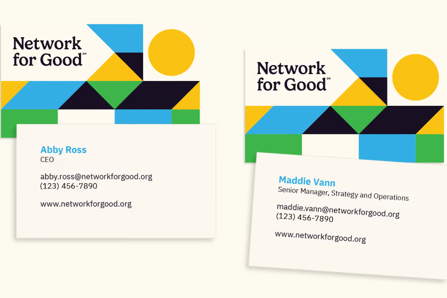
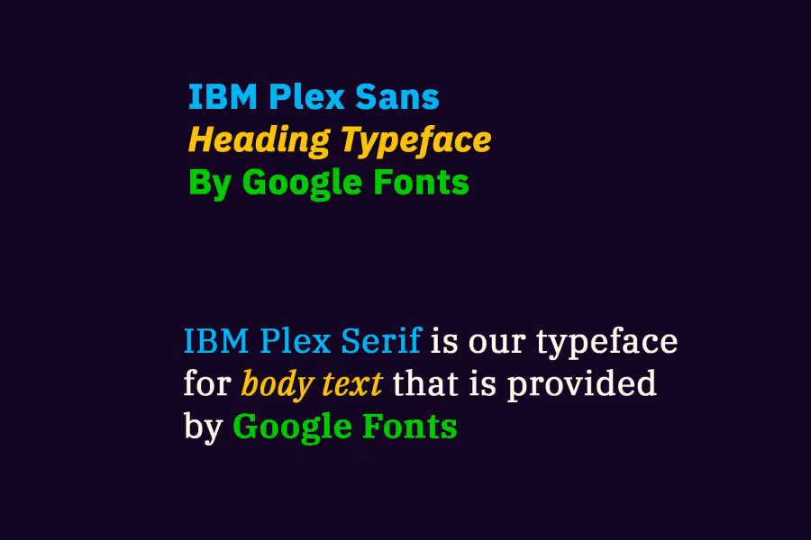

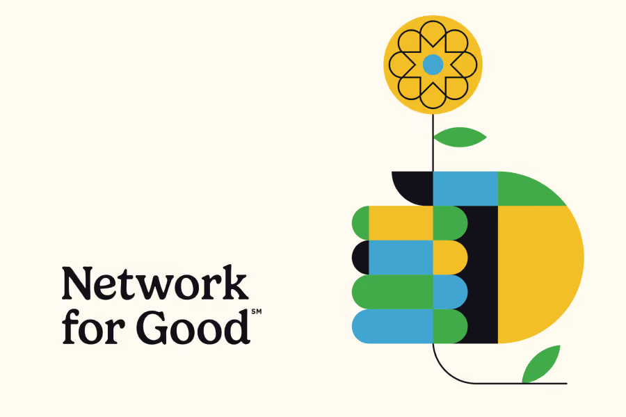
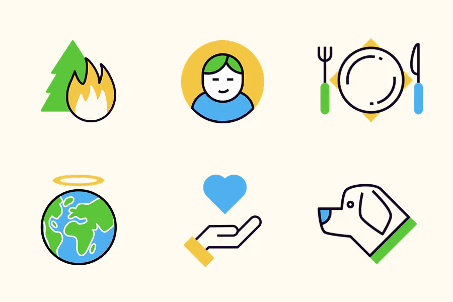
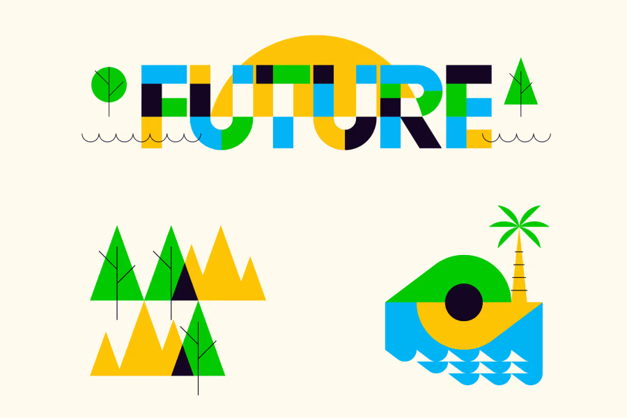
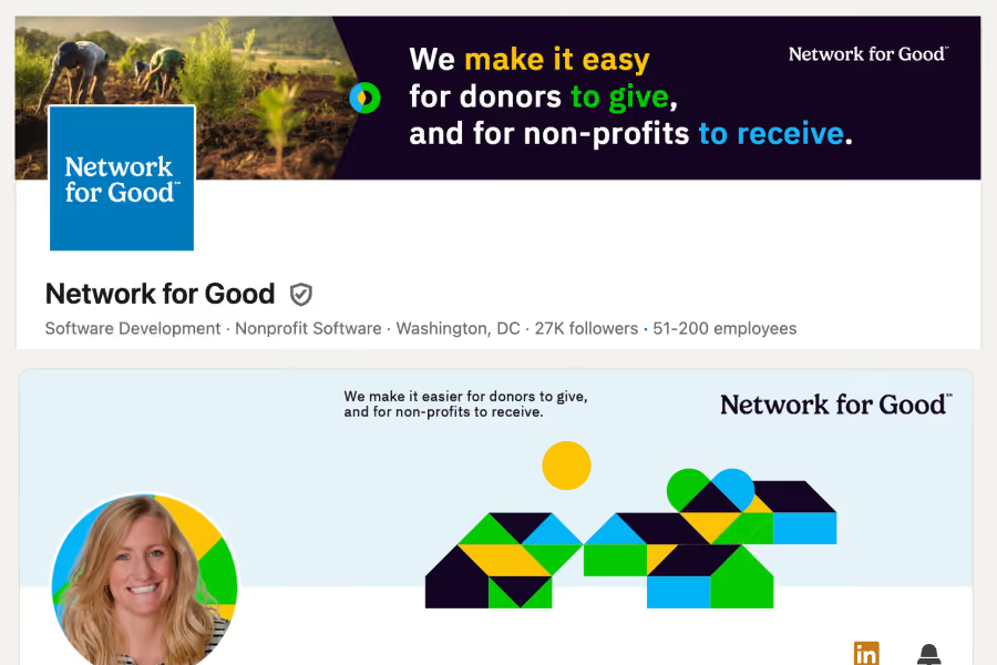
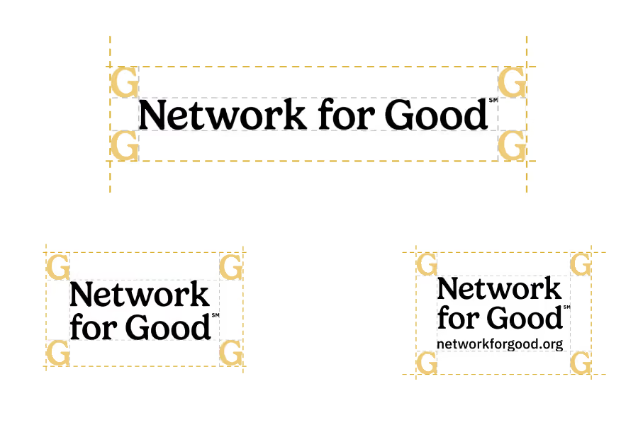
Project notes for Network for Good branding
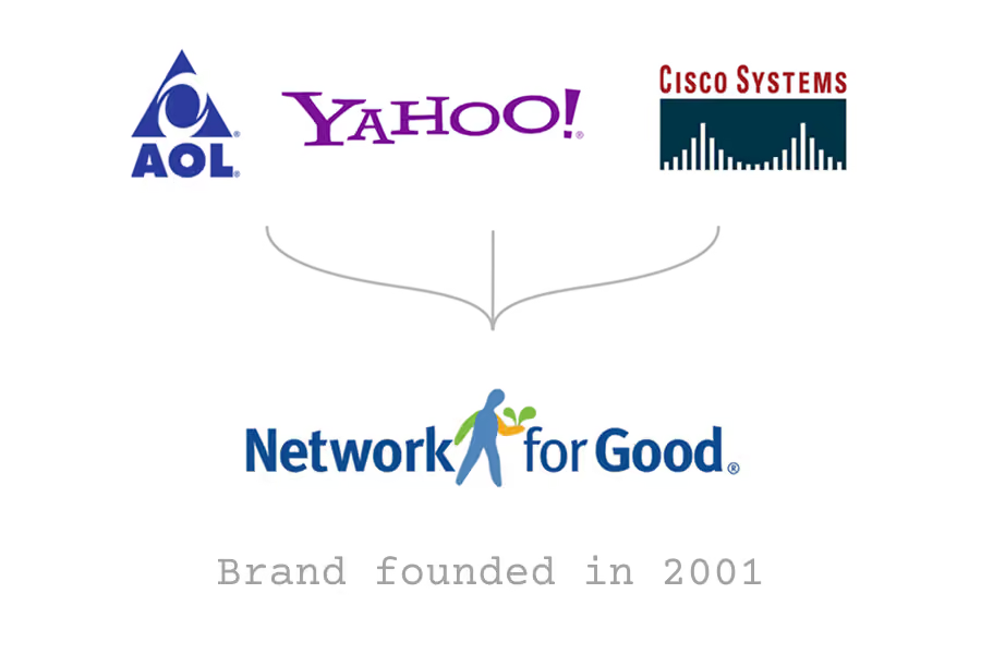
The only challenge that presented itself was one out of both of our control. Network for Good had been part of a private equity rollup under holding company Bonterra. As a donor advised fund platform, they were seeking to carve out a unique identity for their own work and purpose.
We had to navigate some issues around the domain name, but were ultimately able to move forward with executing the entire re-brand without interference. That would come a year later... (see below)
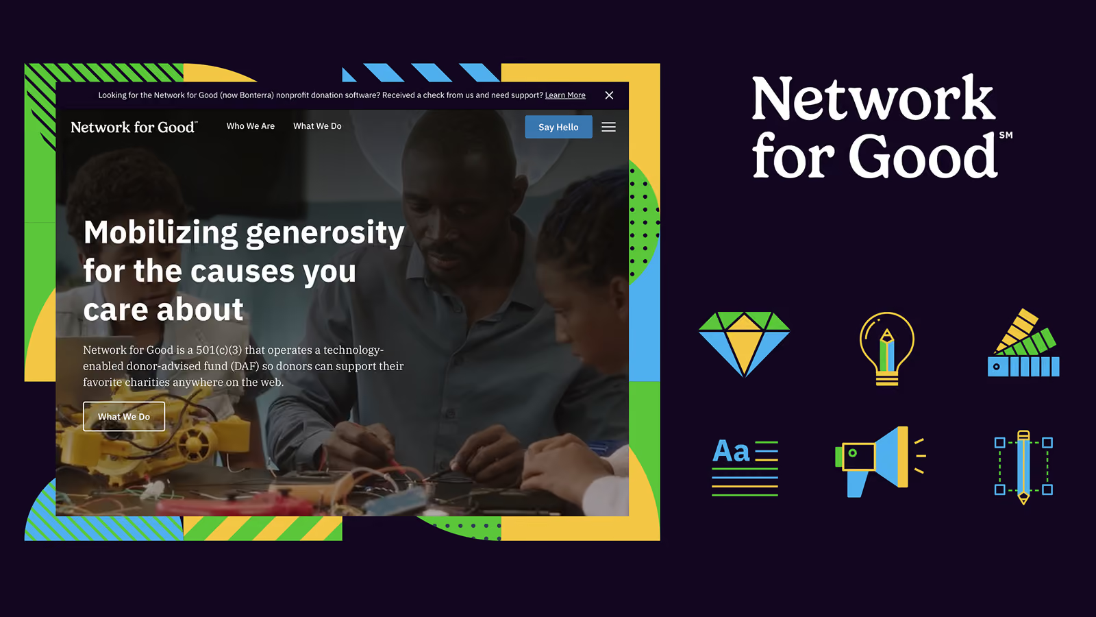
The team at Network for Good was amazing to work with. They were very engaged throughout the discovery process and multiple workshops that I led them through. I enjoyed sinking my teeth into typeface creative and scrutiny, as we decided to move in the direction of a logotype (a brand mark that is type based rather than a symbol or icon, which is called a logomark).
Throughout the series of workshops, I created mood boards exploring imagery, color palettes, fonts, and illustration styles. After 3 rounds we had landed on a direction we were all excited about, and that evolved into what you see above.
After the project had been completed, the Network for Good name became a larger issue within the Bonterra ecosystem. Sadly, they required that the name be relinquished entirely. Abby reached back out to see if I would be able to jump back in for a second round and shortening the name to For Good. By that time I was no longer available, so the work was completed by someone else and has changed significantly from what we built.
Austin Petito (illustration)
Spotlite
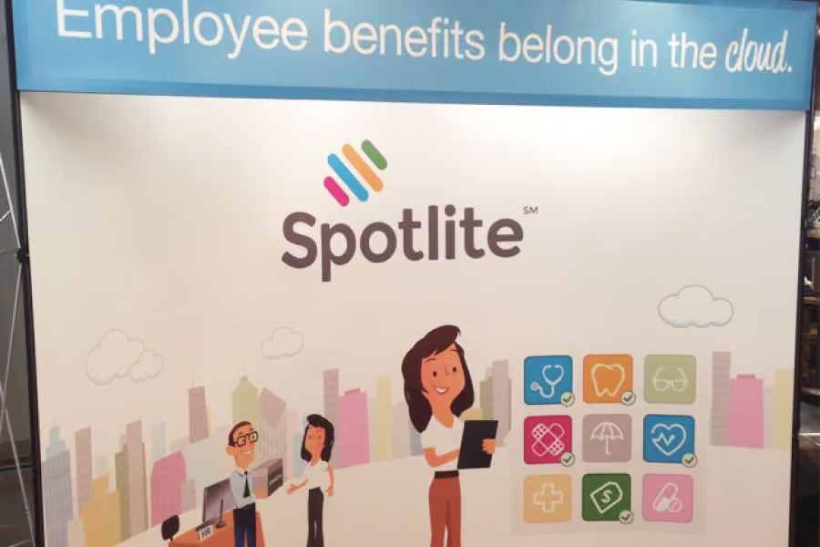
Project notes for Spotlite branding
None to speak of. The founder was excited for a significant refresh and I loved the ability to include this in my scope as Art Director.
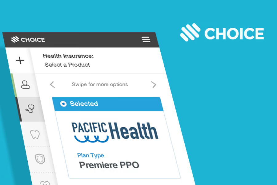
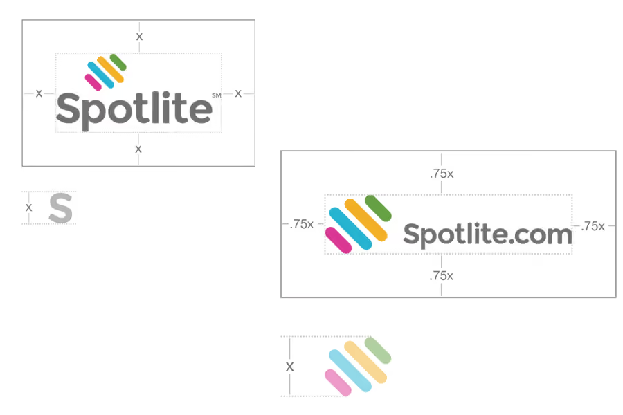
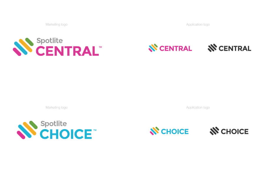
Aside from the primary company mark, we also had multiple products/platforms that were taken into consideration. I worked on a naming strategy for them based on their utility. Spotlite Choice was the benefits enrollment tool for employees. Spotlite Central was the command hub for employers to manage their benefits packages and employees. Spotlite Relay was the EDI which ran sensitive personal and election data between the app and health plans.
As customer facing products, both Choice and Relay had their own brand marks for use within the employer and employee experiences.
Rally Health acquired Spotlite 18 months after I had joined. The Chief Creative Officer at Rally later conveyed that a significant part of their decision had come from the personality and authenticity of the brand compared to other targets they were looking at.
The benefits tool then evolved into Rally Choice, keeping hold of the product name rooted in the benefit selection experience for employees going through enrollment.
Marbella II
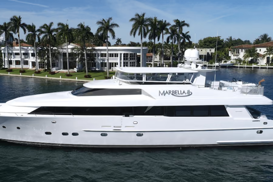
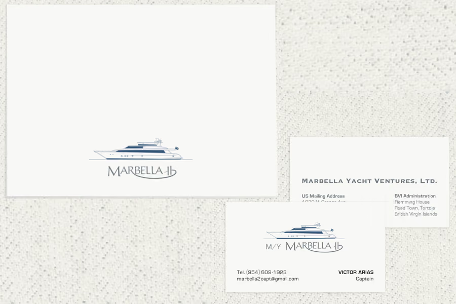
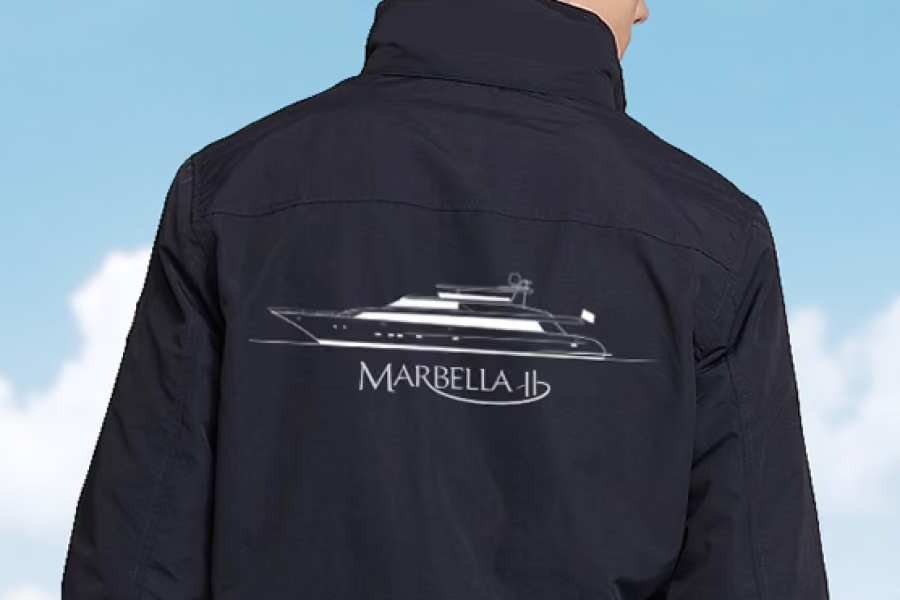
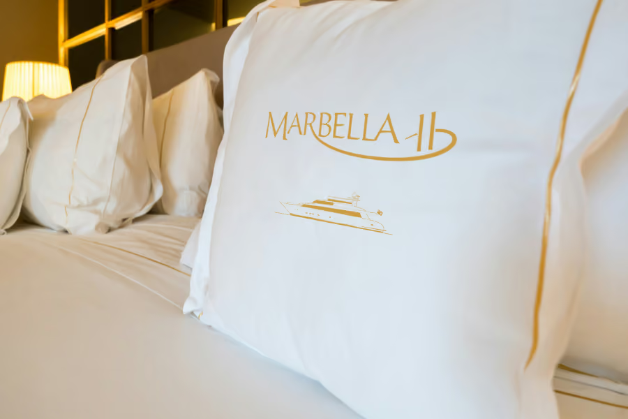
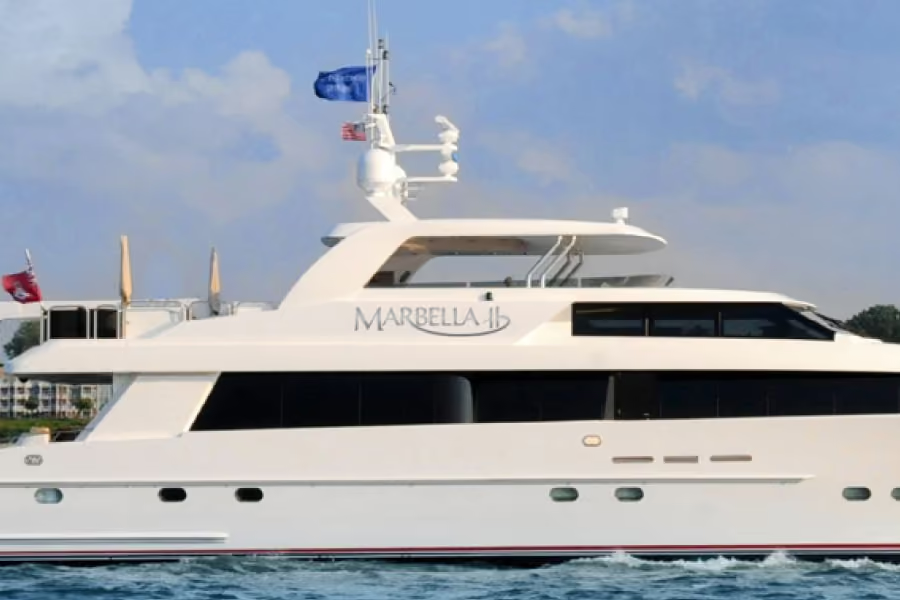
Project notes for Marbella II yacht branding
My only complaint was I didn't get to spend an excursion on it personally. Aside from that, it was a dream. Working with a high net worth individual who has impeccable taste is a little intimidating, but we made excellent collaborators.
I was fortunate enough to see it in the wild recently in 2025 while on an aquatic company outing in Ft. Lauderdale.
Upon round three of my concepts, he simply nodded and said "This is it."
At some point it became a charter vessel, available for weekly occupancy. Today, it is back in another private owner's hands. But the identity remains the same!
ConnexPay (Exploration)
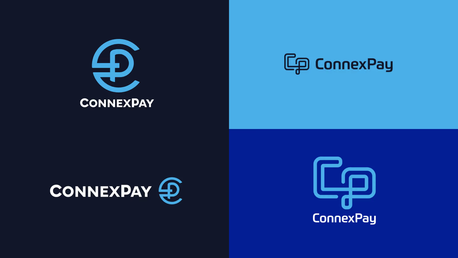
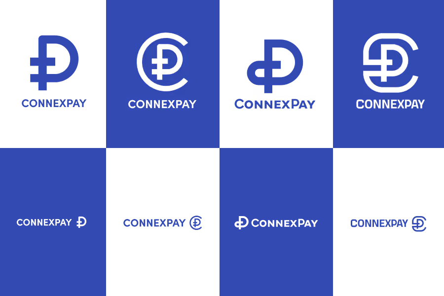
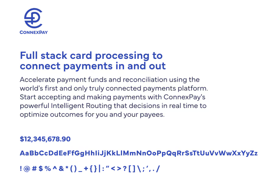
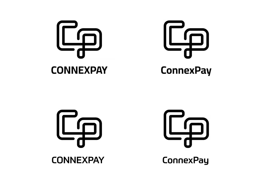
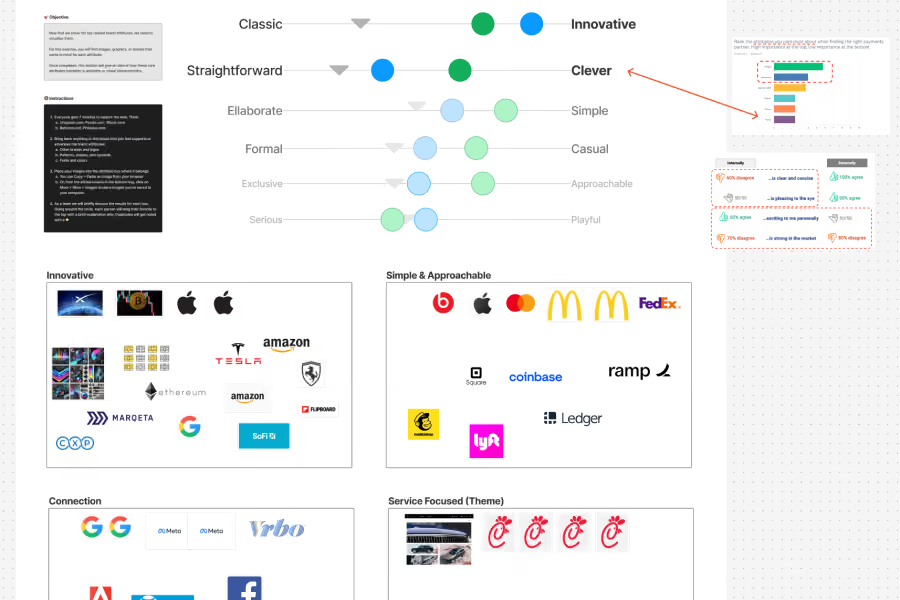
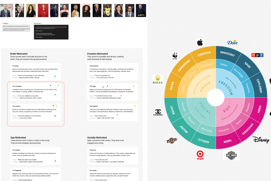
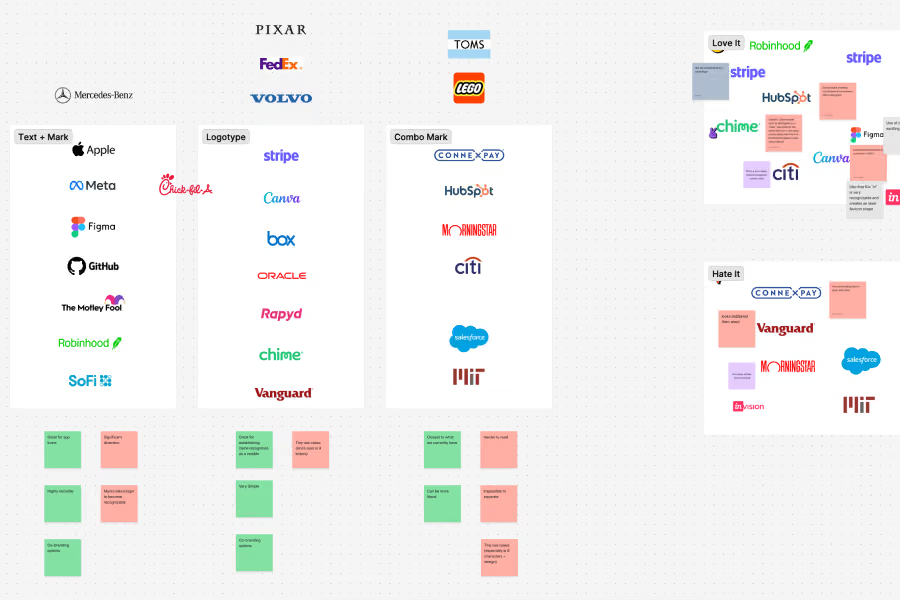
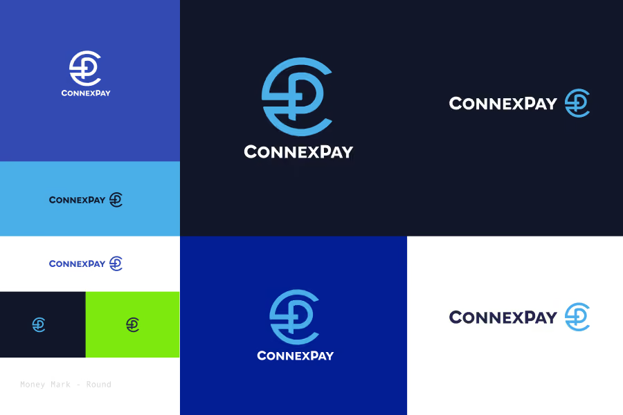
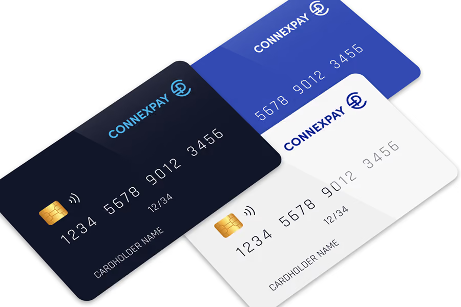
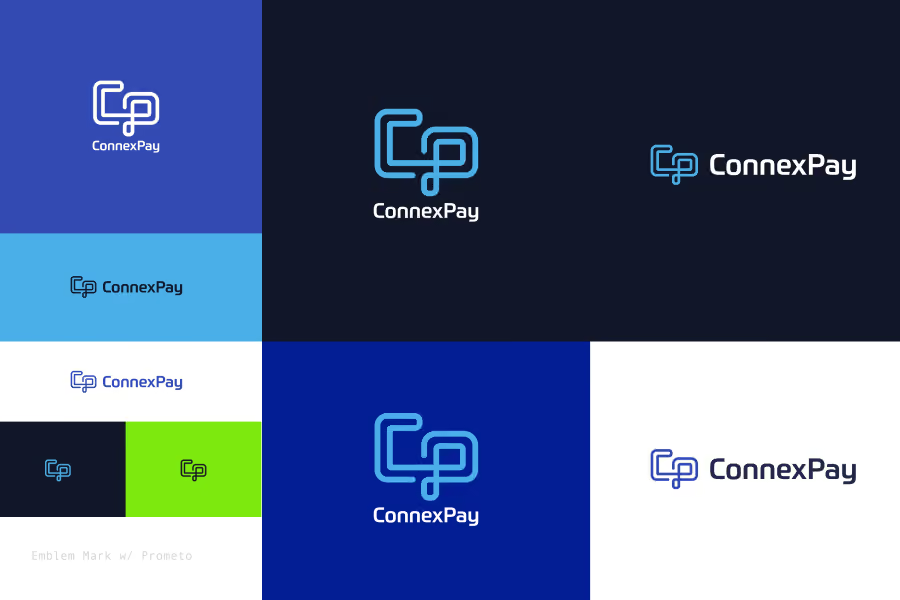
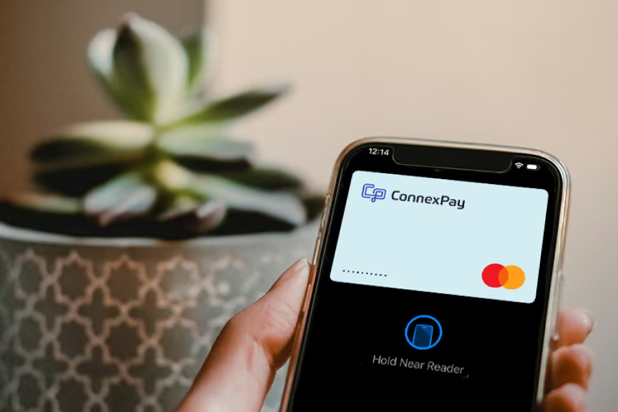
Project notes for ConnexPay brand exploration and spec work
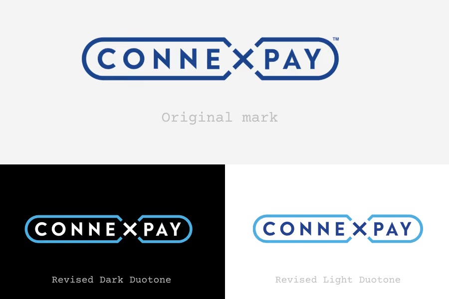
One of the challenges with the original mark (pictured at the end) was that people didn't see the X and pronounced our name 'Con-Pay' with an obnoxious frequency. Or they'd put the emphasis on 'CON' rather than 'EX' where we wanted it.
We were competing with companies who had their brand on F1 cars and courses, Premier League kits, and billboards.
The refresh that resulted to our color palette and mark were still worth the time spent going through exercises and workshops.
As a fast growing company with high expectations on revenue, changing out the logomark became too big a distraction from our tactical goals. With digital and physical virtual cards as well as host of partners using the original, we opted to implement duotone changes to the existing logo to make the name separate from the surrounding pill outline. These versions improved readability and freshness along with the updated palette and collateral across the board.
Gordon Eckler did a significant amount of work with us at ConnexPay. As we plowed through concepts, he came up with the idea of adding a simple slash to a P in order to make it fit in with other global currency symbols. That became the basis for the round version seen above which I continued running with as I also created the other version meant to play on the idea of "payment rails"
Vertical
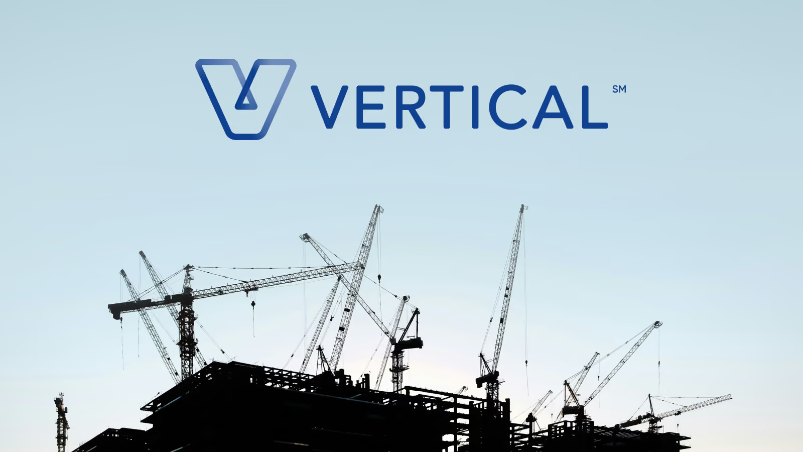
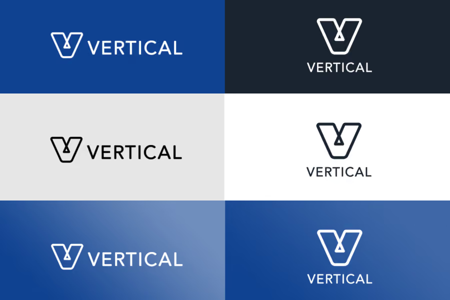
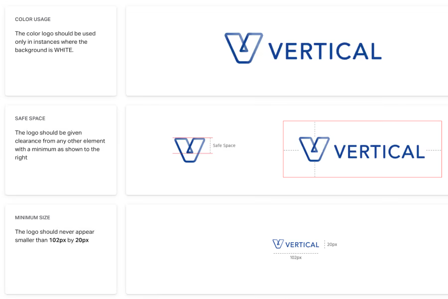
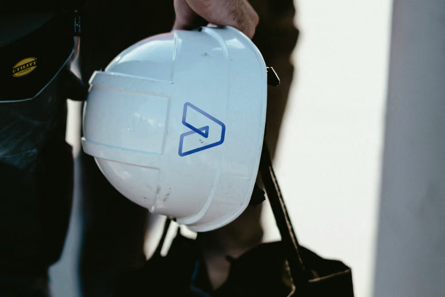
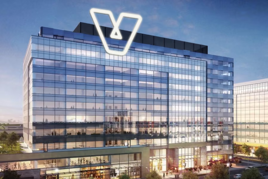
The infinite V was a nod to the problem and process we were solving for that repeated month after month for our clients. It also gave an architectural vibe of support.
Project notes for Vertical branding
Not many given we were our own stakeholders.
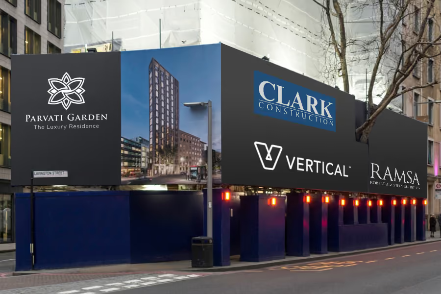
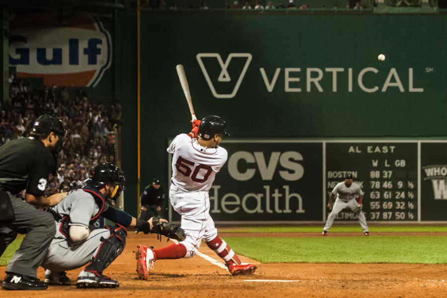
At the early stage, it's a lot of fun to dream about the moonshot. (I can't convey how much potential there was and still is in this space). Showing what it could look like on construction sites and our own future office was simple but thrilling. With one of the founders being a massive Red Sox fan, I couldn't help but throw in what it could look like on the green monster.
While the shortened name and matured brand were of material benefit, it turns out they won't save a startup from other challenges in reaching exit velocity.
Jenine Early is a motion designer and spouse to one of the co-founders. We both worked through a handful of concepts and picked this one she developed the early version of to fully develop.
Charis Courses

Marvee